

| << Chapter < Page | Chapter >> Page > |
In Google Spreadsheet, simply select Form from your ribbon. In the dropdown menu we will find “Show summary of responses” in the response for each qualitative question you will see a bar chart, a pie chart, and the frequency and relative frequency data.
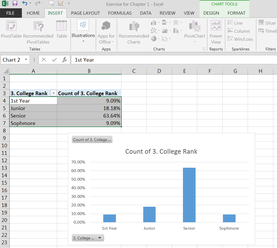
If you go back to your page with your pivot chart and bar chart and you select the categories of your data (in the example below college rank categories) and the relative frequency column (highlight them with your mouse), then go to the insert tab in your ribbon and select recommended charts, pie and then mouse over your OK button and you will have a pie chart on your Excel spreadsheet. You can mouse over the space provided for a title and give your pie chart a more descriptive title.
At your computer, try this exercise: (1) Open the file, Statistics First Day of Class Survey that you worked on previously (2) open the file in Google Spreadsheet or Excel; (3) create a new worksheet tab and label it Graphs for Categorical Data; (4) pick a column of data that is categorical and has been “cleaned” and create a bar graph and a pie graph with all the appropriate labels; And (5) save the file again and post in the appropriate Moodle assignment.
The easiest way to create a histogram in Excel is to use the data analysis package or work from a pivot table with frequency bins that you have previously defined. Using an existing pivot table you will create a graph just as you did above to create a bar graph but you will need to change the spacing of the “bars.” This is accomplished by double clicking on a data bar in your graph to highlight it (you will see little circles in the four corners of the bar(s)). That action will bring up a pop up menu called “Format Data Point” or “Format Data Series.” It is that menu that has “series options” with a gap width marker. The gap width can be changed by sliding the marker on the line or changing the percentage of the gap width to “0%”. With a little playing you can mouse over the Chart Title and give it a descriptive title. You can also add chart elements by mousing over the “Add Chart Element” in the “Chart Tools”, “Design tab.” A histogram is complete with the axis labeled, descriptive title and 0% gap between the bars.
Using data analysis: You will highlight your column of data, select the data tab on the ribbon. The last option on the data menu is “Data Analysis,” click on data analysis and a popup menu will appear with the option of “histogram.” After you have selected histogram from the data analysis menu, click on the OK button. Another popup menu will appear. It will ask for bin range. If you do not specify a bin range, Excel will automatically give you bin ranges but they may or may not be appropriate. Remember that you should select about 5-15 bins for your data (depending on the number of data points in your data set, less data, less bins).
If you want to create your own bins: The best way to calculate bins given in your book is to look at the range of your data and then divide that range into equal parts. For this example let’s use a width of thirty since thirty credit hours a year is fairly equivalent to one year of college credit. You will need to select the upper bounds of your bins and label them as bins on your spread sheet. You will create a column of bin data on your spreadsheet. Then, place the cell address (beginning celladdress:end cell address) into the box provided for bin range. Make sure that labels are selected as shown by a check mark. If you have a label for your column of quantitative data that you will be using to create a histogram, then you must have a label for your bins. It is always a best practice to label data. Note that the picture of the Excel spreadsheet has my bins in the right most column. The other columns with bin and frequency were generated by Excel when it produced the histogram. Note that I have begun to relabel the names of the bins in the left most column labeled “credit hour bins” to the midrange or the column and that change is automatically registered on the graph x-axis.
Notification Switch
Would you like to follow the 'Collaborative statistics using spreadsheets' conversation and receive update notifications?

|
|

|
|

|
|

|
|
|
|
|
|
|
|

|
|
|
|
|
|
|

|