

| << Chapter < Page | Chapter >> Page > |
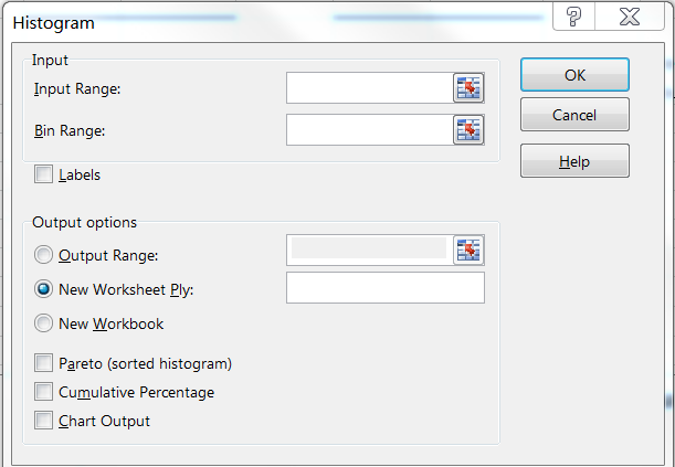
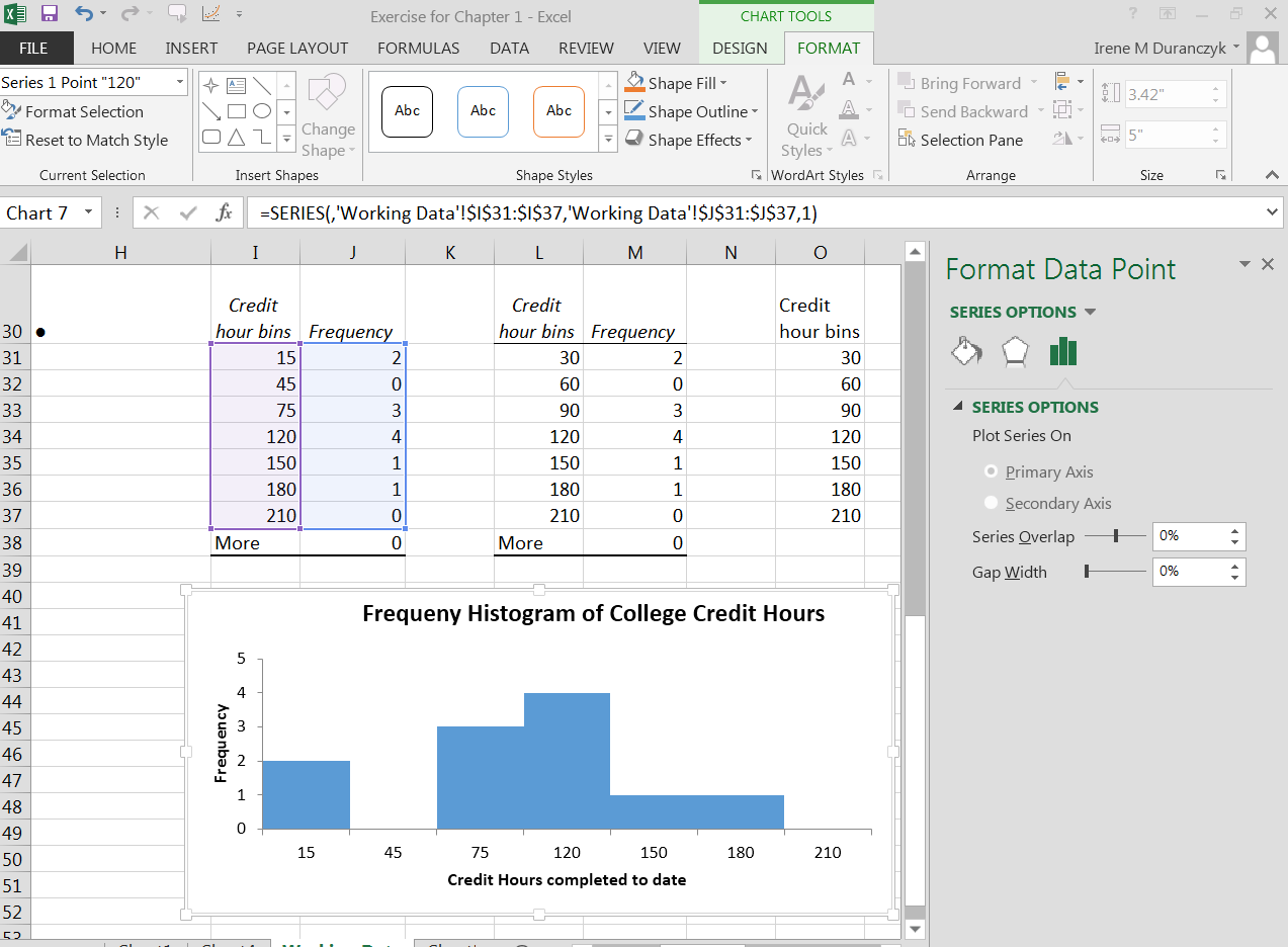
For output you can select either a cell on the Excel spreadsheet you are working on or you can select a new worksheet. You will then have three boxes at the bottom of that popup menu that you can check off. For our purposes you will select “chart output” only. This will create a histogram (of sorts). You will need to go back and make the bars touch, put in your title and axis labels plus you will need to change the bins labels since you will have the bin upper bounds in the center of the bar. You can go back to the chart output created by Excel when you created your histogram and change the bin name to the midpoint value. You will then have the correct data point on you histogram. See the image below for details on that process.
Google spreadsheet will not allow you to eliminate the spaces between the bars so we will not be using Google Spreadsheet to display quantitative data. We will only use Excel.
At your computer, try this exercise: (1) Open the file, Statistics First Day of Class Survey that you worked on previously (2) open the file in Excel; (3) create a new worksheet tab and label it Graphs for Quantitative Date; (4) pick a column of data that is quantitative and has been “cleaned” and create a histogram with appropriate spacing, titles, midpoints, and axis labels; (5) save the file again and post in the appropriate Moodle assignment.
Creating box plots
There are two methods for us to create box plots in Excel. We will use the free excel template by Vertex42 that has been modified by Janet Stottlemyer and Irene Duranczyk.
This template is on your course shell (Moodle) or can be downloaded from the Vertex42 website given: http://www.vertex42.com/ExcelTemplates/box-whisker-plot.html . The other method to create a box plot can be found by watching the video at http://www.youtube.com/watch?v=bgaN446TQXo and downloading the sample file found at that link.
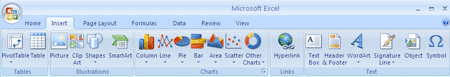
To use the Vertex42 template, follow the directions on the template spreadsheet to create the box plot. The directions are on the “BoxPlot” spreadsheet tab. To create a boxplot with outliers. You will need a few additional steps. The template only identifies the one upper and one lower outlier (if there is one) You will need to follow the steps below to create a marker for other near (1.5*IQR to less than 2.0 IQR) or far (2.0+IQR or more) outliers. First, identify your outliers and make a list of the outliers labeled as near or far outliers. Remember that one outlier will already be plotted on your graph. Do not re-plot that min or max outlier. With your spreadsheet open and your data already graphed on the BoxPlot template, with your mouse, click on the graphed data. When you click on the graphed data, chart tools will be highlighted. While this is highlighted, go to the insert tap. Once that tab is opened you should see “Illustrations" as one of the options on the ribbon. On the Insert tab, in the Illustrations group, click Shapes.
Click the shape that you want, click anywhere in the document, and then drag to place the shape. For our box plots use the circle from basic shapes for near outliers and use the star shape from stars and banners for the far outliers. To create a perfect star or circle (or constrain the dimensions of other shapes), press and hold SHIFT while you drag. Add one shape for each outlier. You will then copy picture and add this figure to your statistics document. You can change the name of the columns by adding your category name in the data table. You are only to change the names in the data table and only add data to the data table. Only make changes in the “blue” highlighted fields. If you want fewer columns of data delete the columns you are not using. If you want more columns, talk to your instructor or follow the directions on the right hand side of the “BoxPlot” spreadsheet. See the image below of the results of the Data Table that is highlighted blue.
Notification Switch
Would you like to follow the 'Collaborative statistics using spreadsheets' conversation and receive update notifications?
|
|
|
|
|

|
|

|
|

|
|
|
|
|

|
|

|
|

|
|

|