

| << Chapter < Page | Chapter >> Page > |
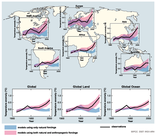
The bottom of Figure Model Simulations and Figure Global Surface Temperature Comparisons presents the most compelling argument that current climate change is caused in large part by humans. The bottom panel of Figure Model Simulations shows 19 climate model simulations between 1900 and 2000 with human influences left out of the simulations. The thick black line represents the observed global mean surface temperature over this time. Compare this figure with that of Figure Global Surface Temperature Comparisons , which depicts a series of graphs that plot temperature anomalies against time from the early 1900s to 2000. The blue color shading on these graphs shows the computer model projections without anthropogenic effects, while the pink shading includes them. The black line represents the actual measured air temperatures in each of the locations over which the inlaid graphs are positioned. Notice that without humans the blue shading stays level or decreases with time. Compared with the pink shading and the black line, which both increase with time, and we find that these climate simulations cannot accurately represent the past climate without anthropogenic effects. Simply put, these models are unable to represent our current climate without greenhouse contributions from humans. Rigorous testing like this proves these models are robust and well-designed to simulate future climate conditions.
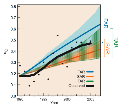
The IPCC began its work in the early 1990’s and they have released four reports on climate and climate change. In each report they have included evidence as shown in the sections above. Since a few decades have passed since their initial reports, we can compare the actual changes since 1990 to the IPCC forecasts. Figure Observed Temperatures vs. Projected Temperatures compares the observed global average surface temperature to each of the first three reports (the fourth was released in 2007). This figure reveals that both the second (SAR) and third (TAR) reports have been conservative in the projection of globally averaged temperature. It also shows that the observed warming has fallen into the range of expected warming by the IPCC. Due to their success in accurately predicting changes in earth’s climate over this time period, the entire body of scientists shared a part of the 2007 Nobel Prize.
Notification Switch
Would you like to follow the 'Sustainability: a comprehensive foundation' conversation and receive update notifications?

|
|

|
|

|
|

|
|
|
|
|

|
|

|
|

|
|

|
|

|