<< Chapter < Page Chapter >> Page >

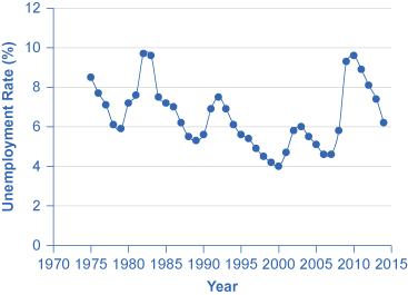
One common line graph is called a time series , in which the horizontal axis shows time and the vertical axis displays another variable. Thus, a time series graph shows how a variable changes over time. [link] shows the unemployment rate in the United States since 1975, where unemployment is defined as the percentage of adults who want jobs and are looking for a job, but cannot find one. The points for the unemployment rate in each year are plotted on the graph, and a line then connects the points, showing how the unemployment rate has moved up and down since 1975. The line graph makes it easy to see, for example, that the highest unemployment rate during this time period was slightly less than 10% in the early 1980s and 2010, while the unemployment rate declined from the early 1990s to the end of the 1990s, before rising and then falling back in the early 2000s, and then rising sharply during the recession from 2008–2009.

U.s. unemployment rate, 1975–2014

The graph shows unemployment rates since 1970. The highest rates occurred around 1983 and 2010.
This graph provides a quick visual summary of unemployment data. With a graph like this, it is easy to spot the times of high unemployment and of low unemployment.

Pie Graphs

A pie graph (sometimes called a pie chart ) is used to show how an overall total is divided into parts. A circle represents a group as a whole. The slices of this circular “pie” show the relative sizes of subgroups.

[link] shows how the U.S. population was divided among children, working age adults, and the elderly in 1970, 2000, and what is projected for 2030. The information is first conveyed with numbers in [link] , and then in three pie charts. The first column of [link] shows the total U.S. population for each of the three years. Columns 2–4 categorize the total in terms of age groups—from birth to 18 years, from 19 to 64 years, and 65 years and above. In columns 2–4, the first number shows the actual number of people in each age category, while the number in parentheses shows the percentage of the total population comprised by that age group.

U.s. age distribution, 1970, 2000, and 2030 (projected)
Year Total Population 19 and Under 20–64 years Over 65
1970 205.0 million 77.2 (37.6%) 107.7 (52.5%) 20.1 (9.8%)
2000 275.4 million 78.4 (28.5%) 162.2 (58.9%) 34.8 (12.6%)
2030 351.1 million 92.6 (26.4%) 188.2 (53.6%) 70.3 (20.0%)

Pie graphs of the u.s. age distribution (numbers in millions)

The image shows three pie graphs representing age distribution in the U.S. Image (a) shows that in 1970, people 19 and under made up 77.2 million or 37.6% of the population; people between ages 20 and 64 made up 107.7 million or 52.5% of the population; and people 65 or older made up 20.1 million or 9.8% of the population. Image (b) shows that in 2000, people 19 and under made up 78.4 million or 28.5% of the population; people between ages 20 and 64 made up 162.2 million or 58.9% of the population; and people 65 or older made up 34.8 million or 12.6% of the population. Image (c) projects that in 2030, people 19 and under will make up 92.6 million or 26.4% of the population; people between ages 20 and 64 made up 188.2 million or 53.6% of the population; and people 65 or older made up 70.3 million or 20% of the population.
The three pie graphs illustrate the division of total population into three age groups for the three different years.

In a pie graph, each slice of the pie represents a share of the total, or a percentage. For example, 50% would be half of the pie and 20% would be one-fifth of the pie. The three pie graphs in [link] show that the share of the U.S. population 65 and over is growing. The pie graphs allow you to get a feel for the relative size of the different age groups from 1970 to 2000 to 2030, without requiring you to slog through the specific numbers and percentages in the table. Some common examples of how pie graphs are used include dividing the population into groups by age, income level, ethnicity, religion, occupation; dividing different firms into categories by size, industry, number of employees; and dividing up government spending or taxes into its main categories.

Questions & Answers

What is inflation
Bright Reply
a general and ongoing rise in the level of prices in an economy
AI-Robot
What are the factors that affect demand for a commodity
Florence Reply
price
Kenu
differentiate between demand and supply giving examples
Lambiv Reply
differentiated between demand and supply using examples
Lambiv
what is labour ?
Lambiv
how will I do?
Venny Reply
how is the graph works?I don't fully understand
Rezat Reply
information
Eliyee
devaluation
Eliyee
t
WARKISA
hi guys good evening to all
Lambiv
multiple choice question
Aster Reply
appreciation
Eliyee
explain perfect market
Lindiwe Reply
In economics, a perfect market refers to a theoretical construct where all participants have perfect information, goods are homogenous, there are no barriers to entry or exit, and prices are determined solely by supply and demand. It's an idealized model used for analysis,
Ezea
What is ceteris paribus?
Shukri Reply
other things being equal
AI-Robot
When MP₁ becomes negative, TP start to decline. Extuples Suppose that the short-run production function of certain cut-flower firm is given by: Q=4KL-0.6K2 - 0.112 • Where is quantity of cut flower produced, I is labour input and K is fixed capital input (K-5). Determine the average product of lab
Kelo
Extuples Suppose that the short-run production function of certain cut-flower firm is given by: Q=4KL-0.6K2 - 0.112 • Where is quantity of cut flower produced, I is labour input and K is fixed capital input (K-5). Determine the average product of labour (APL) and marginal product of labour (MPL)
Kelo
yes,thank you
Shukri
Can I ask you other question?
Shukri
what is monopoly mean?
Habtamu Reply
What is different between quantity demand and demand?
Shukri Reply
Quantity demanded refers to the specific amount of a good or service that consumers are willing and able to purchase at a give price and within a specific time period. Demand, on the other hand, is a broader concept that encompasses the entire relationship between price and quantity demanded
Ezea
ok
Shukri
how do you save a country economic situation when it's falling apart
Lilia Reply
what is the difference between economic growth and development
Fiker Reply
Economic growth as an increase in the production and consumption of goods and services within an economy.but Economic development as a broader concept that encompasses not only economic growth but also social & human well being.
Shukri
production function means
Jabir
What do you think is more important to focus on when considering inequality ?
Abdisa Reply
any question about economics?
Awais Reply
sir...I just want to ask one question... Define the term contract curve? if you are free please help me to find this answer 🙏
Asui
it is a curve that we get after connecting the pareto optimal combinations of two consumers after their mutually beneficial trade offs
Awais
thank you so much 👍 sir
Asui
In economics, the contract curve refers to the set of points in an Edgeworth box diagram where both parties involved in a trade cannot be made better off without making one of them worse off. It represents the Pareto efficient allocations of goods between two individuals or entities, where neither p
Cornelius
In economics, the contract curve refers to the set of points in an Edgeworth box diagram where both parties involved in a trade cannot be made better off without making one of them worse off. It represents the Pareto efficient allocations of goods between two individuals or entities,
Cornelius
Suppose a consumer consuming two commodities X and Y has The following utility function u=X0.4 Y0.6. If the price of the X and Y are 2 and 3 respectively and income Constraint is birr 50. A,Calculate quantities of x and y which maximize utility. B,Calculate value of Lagrange multiplier. C,Calculate quantities of X and Y consumed with a given price. D,alculate optimum level of output .
Feyisa Reply
Answer
Feyisa
c
Jabir

Get Jobilize Job Search Mobile App in your pocket Now!

Get it on Google Play Download on the App Store Now


Source:  OpenStax, Principles of economics. OpenStax CNX. Sep 19, 2014 Download for free at http://legacy.cnx.org/content/col11613/1.11
Google Play and the Google Play logo are trademarks of Google Inc.

Notification Switch

Would you like to follow the 'Principles of economics' conversation and receive update notifications?

Ask